Background
BayBridge Senior Living strategically selected the quaint town of Unionville, Ontario to develop a new, upscale retirement residence. The market was highly competitive, and the new residence had to support sales expectations, at a higher rental price than the local competition.

Challenge
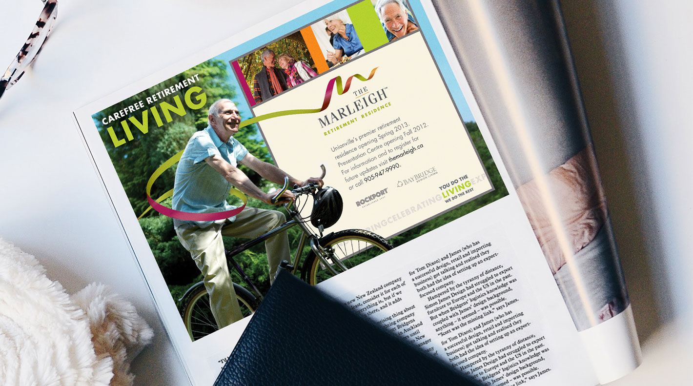
Ascenda Brand Marketing was tasked to develop a brand that would position the property as modern, vibrant and well-appointed with a carefree lifestyle. The name and visual brand of the property needed to stand out and resonate with two target audiences: Seniors and their primary caregivers/decision-makers.

Solution
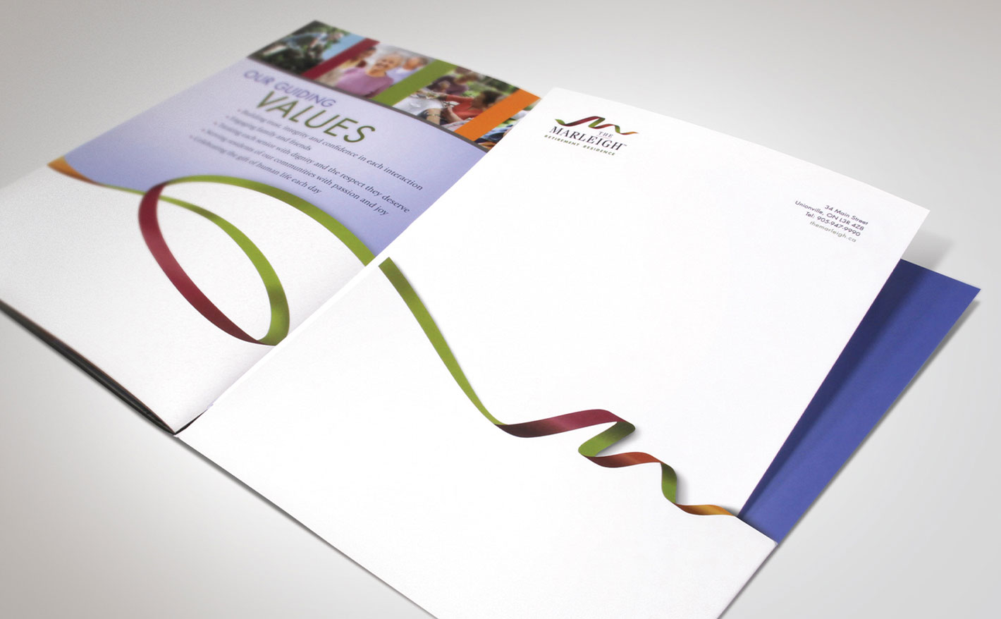
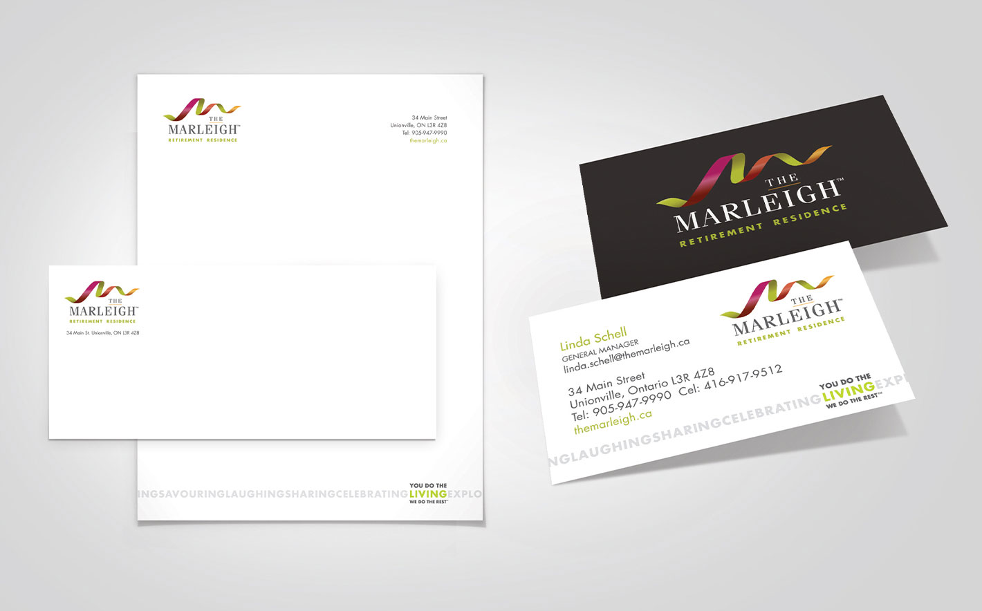
The Marleigh brand was strategically developed and clearly communicated through various brand elements including the logo, tagline, visual cues, brand guideline and brand extensions. The visual cues successfully communicated the carefree lifestyle the community was intending to deliver.
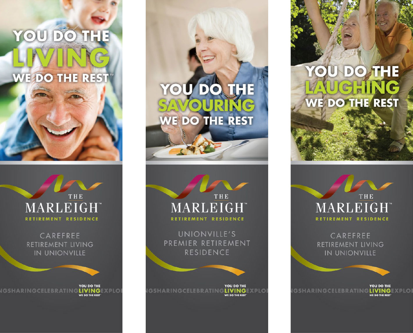
Ascenda Brand Marketing created a tagline that was dynamic and capable of expanding and delivering a breadth of meaning to the target audience. By simply interchanging the emotive word within the tagline, it was able to communicate much more.
Results
The branding initiative was a resounding success! The property was fully rented ahead of opening and the units were able to generate a higher rental price-point than the local competition. The tagline garnered great recognition. BayBridge embraced the tagline to the point that they decided to utilize it across all of their general communities.